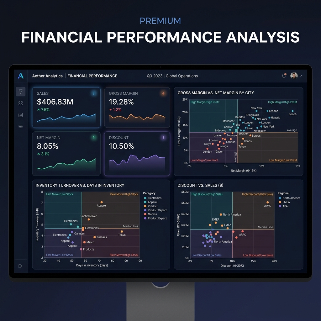
From margin analysis to revenue leakage detection, every critical business function lives inside Revelaer BI. Explore each capability below.
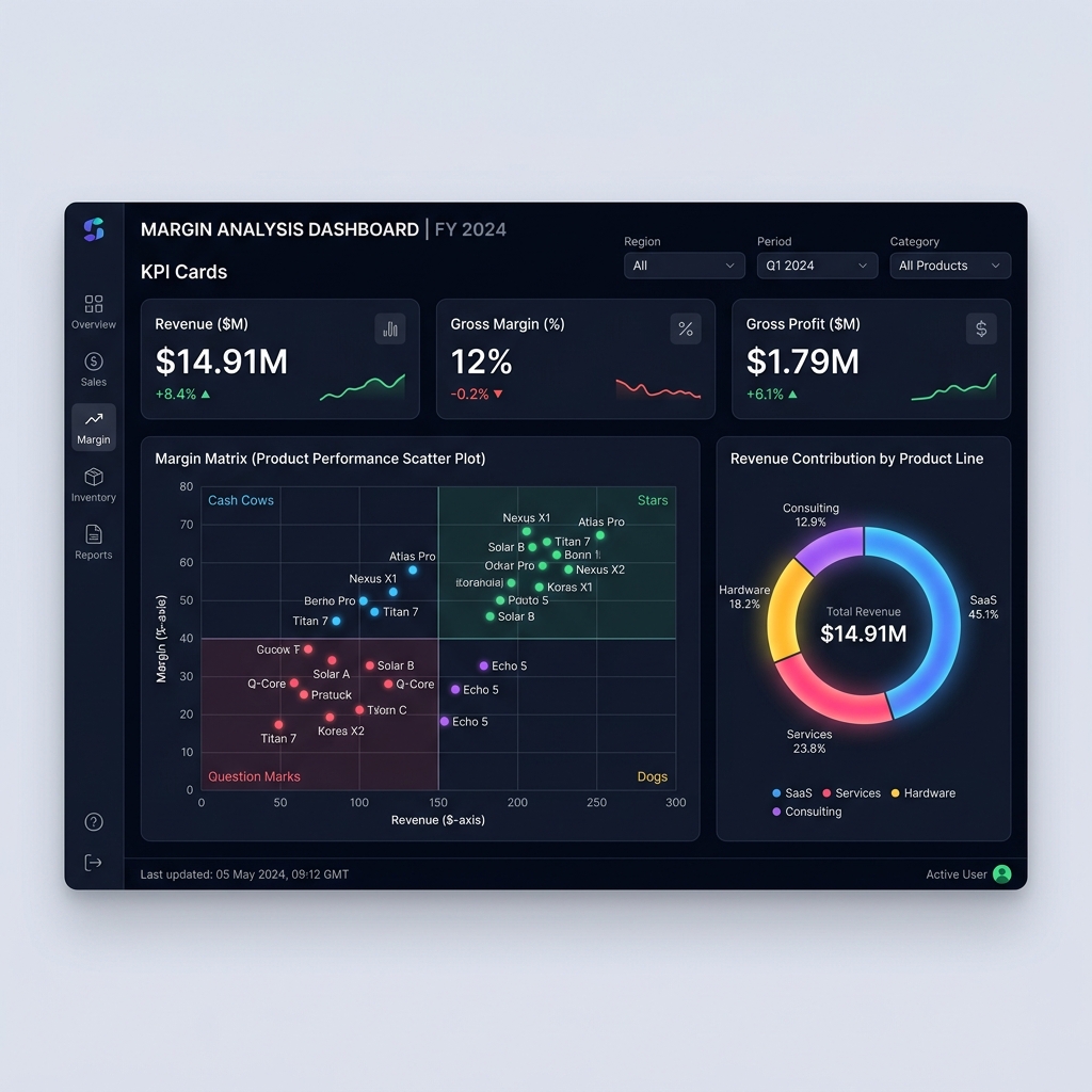
Visualize revenue contribution across every product line with intelligent margin matrices. Our AI segments products into cash cows, stars, question marks, and dogs — automatically surfacing where to invest and where to cut.

Donut charts break down product-level revenue share in real time across all categories.
Scatter plot maps YTD sales performance against gross margin for strategic quadrant analysis.
Headline metrics show $14.91M revenue, 12% gross margin, and $1.79M gross profit at a glance.
Track performance across 6,400+ branches with multi-product revenue breakdowns, break-even Sankey flows, and target achievement scoring. Understand operational health at every level.

Sankey diagrams visualize the path from branch segments through revenue ranges to achievement categories.
Venn diagrams reveal customer overlap across Product A, B, and C for cross-sell opportunities.
78% overall achievement tracked with Moderate, Good, Severe, and Excellent classifications.
Manage $1B+ in receivables with country-level donut breakdowns, aging bucket analysis, and AI-prioritized collection queues. Know exactly who owes what, how long they've owed it, and who's responsible for collecting.

Four-tier aging analysis from 0-30 to 90+ days with customer risk assessment at each level.
Automated Low/Medium/High risk classification per customer based on payment history and exposure.
Visual grid assigns collection managers by region and tracks performance metrics per collector.
Three interconnected quadrant analyses provide strategic clarity: gross vs net margin by city, inventory turnover vs holding days, and discount impact vs sales volume. Every scatter point tells a story.

Four-quadrant classification across all three charts for rapid strategic identification.
Map turnover rates against days-in-inventory to identify fast movers and dead stock.
Understand the relationship between discount depth and revenue generation per store.
The Leakage Identifier uses Sankey flow diagrams to trace revenue loss across four dimensions: Region → Product Category → Container Type → Customer Segment. Color-coded profitability indicators reveal the exact paths draining your margins.

Alluvial diagram traces profit leakage from region through product to customer segment.
Real-time color scale from red (loss) to blue (profit) reveals leakage patterns instantly.
Bottom KPIs show total leakage value, percentage, and potential recovery opportunities.